Syncare
Syncare is a provider-patient management platform designed for a healthcare startup

Role:
UX designer
Duration:
February 2025
The solution
Exploring the needs
HUEURISTIC EVALUATION
The design was cluttered and hard to use, which made providers less efficient.
Because I had limited access to users for this design challenge, I used a heuristic evaluation
and design best practices to identify usability issues.

Define
The goal of this flow was simple: replace guesswork with guaranteed efficiency,
ensuring providers always know exactly where to go and what to do next to serve their patient

Ideate
Early sketches to improve information hierarchy

Final design
The design cuts down on visual noise and puts the most important patient details front and center, making it easier for providers to move fast and stay focused.
Design solution 1- Patient overview card
Reduced cognitive load by refining the hierarchy and removing color confusion, using green to show when a user has joined the Zoom meeting and a purple stroke to highlight the active state.

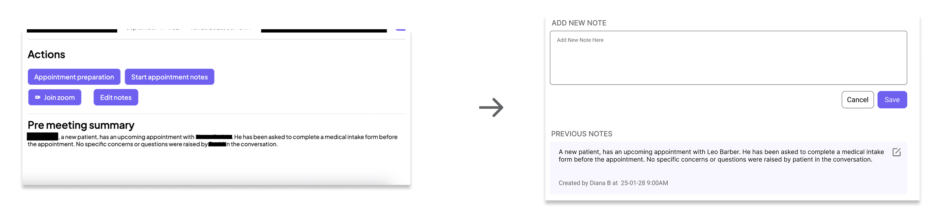
Design solution 2- Speed Documentation
Reduced friction by removing unnecessary buttons and bringing everything into one screen, letting providers write and review notes while viewing patient history, with clear indicators of who wrote each note and when.
Design solution 3- information clarity in a glance
Improved clarity by cleaning up spacing and layout, placing the patient’s name at the top, grouping related actions together, and making patient status easy to see at a glance.

